Gesture recognition in smartphones

This piece from the Aberdeen Group shows accelerometers and gyroscopes becoming universal in smartphones by 2018.

Accelerometers were exotic in smartphones when the first iPhone came out – used mainly for sensing the orientation of the phone for displaying portrait or landscape mode. Then came the idea of using them for dead-reckoning-assist in location-sensing. iPhones have always had accelerometers; since all current smartphones are basically copies of the original iPhone, it is actually odd that some smartphones lack accelerometers.

Predictably, when supplied with a hardware feature, the app developer community came up with a ton of creative uses for the accelerometer: magic tricks, pedometers, air-mice, and even user authentication based on waving the phone around.

Not all sensor technologies are so fertile. For example the proximity sensor is still pretty much only used to dim the screen and disable the touch sensing when you hold the phone to your ear or put it in your pocket.

So what about the user-facing camera? Is it a one-trick pony like the proximity sensor, or a springboard to innovation like the accelerometer? Although videophoning has been a perennial bust, I would argue for the latter: the you-facing camera is pregnant with possibilities as a sensor.

Looking at the Aberdeen report, I was curious to see “gesture recognition” on a list of features that will appear on 60% of phones by 2018. The others on the list are hardware features, but once you have a camera, gesture recognition is just a matter of software. (The Kinect is a sidetrack to this, provoked by lack of compute power.)

In a phone, compute power means battery-drain, so that’s a limitation to using the camera as a sensor. But each generation of chips becomes more power-efficient as well as more powerful, and as phone makers add more and more GPU cores, the developer community delivers new useful uses for them that max them out.

Gesture recognition is already here with Samsung, and soon every Android device. The industry is gearing up for innovation in phone based computer vision with OpenVX from Khronos. When always-on computer vision becomes feasible from a power-drain point of view, gesture recognition and face tracking will look like baby-steps. Smart developers will come up with killer applications that are currently unimaginable. For example, how about a library implementation of Paul Ekman’s emotion recognition algorithms to let you know how you are really feeling right now? Or, in concert with Google Glass, so you will never again be oblivious to your spouse’s emotional temperature.
Update November 19th: Here‘s some news and a little bit of technology background on this topic…
Update November 22:It looks like a company is already engaged on the emotion-recognition technology.

Mobile Malware Update

Blue Coat Systems has published an interesting report on the state of mobile malware. The good news is that in the words of the report “the devices’ security model” is not yet “broken.” This means that smartphones and tablets are still rarely hijacked by viruses in the way that computers commonly are.

Now for the bad news. On the Android side (though apparently not yet on the iOS side), virus-style hijackings have begun to appear:

Blue Coat WebPulse collaborative defense first detected an Android exploit in real time on February 5, 2009. Since then, Blue Coat Security Labs has observed a steady increase in Android malware. In the July-September 2012 quarter alone, Blue Coat
Security Labs saw a 600 percent increase in Android malware over the same period last year.

But this increase is from a minuscule base, and this type of threat is still relatively minor on mobile devices. Instead the report says, “user behavior becomes the Achilles heel.” The main mobile threats are from what the report calls “mischiefware.”

Mischiefware works by enticing the user into doing something unintentional. The two main categories of Mischiefware are:

  1. Phishing, which tricks users into disclosing personal information that can be used for on-line theft.
  2. Scamming, which tricks users into paying far more than they expect for something – like for-pay text (SMS) messages or in-app purchases. Even legitimate service providers can be guilty of this type of ‘gotcha’ activity, with rapacious international data roaming charges, or punitive overage charges on monthly ‘plans.’

“User behavior becomes the Achilles Heel” is hardly a revelation. A more appropriate phrase would be “User behavior remains the Achilles Heel,” since in this respect the mobile world is no different from the traditional networking world.

iPhone 4S not iPhone 5

Technically the iPhone 4S doesn’t really pull ahead of the competition: Android-based phones like the Samsung Galaxy S II.

The iPhone 4S even has some worse specifications than the iPhone 4. It is 3 grams heavier and its standby battery life is 30% less. The screen is no larger – it remains smaller than the standard set by the competition. On the other hand the user experience is improved in several ways: the phone is more responsive thanks to a faster processor; it takes better photographs; and Apple has taken yet another whack at the so-far intractable problem of usable voice control. A great benefit to Apple, though not so much to its users, is that the new Qualcomm baseband chip works for all carriers worldwide, so Apple no longer needs different innards for AT&T and Verizon (though Verizon was presumably disappointed that Apple didn’t add a chip for LTE support).

Since its revolutionary debut, the history of the iPhone has been one of evolutionary improvements, and the improvements of the iPhone 4S over the iPhone 4 are in proportion to the improvements in each of the previous generations. The 4S seems to be about consolidation, creating a phone that will work on more networks around the world, and that will remain reliably manufacturable in vast volumes. It’s a risk-averse, revenue-hungry version, as is appropriate for an incumbent leader.

The technical improvements in the iPhone 4S would have been underwhelming if it had been called the iPhone 5, but for a half-generation they are adequate. By mid-2012 several technologies will have ripened sufficiently to make a big jump.

First, Apple will have had time to move their CPU manufacturing to TSMC’s 28 nm process, yielding a major improvement in battery life from the 45 nm process of the current A5, which will be partially negated by the monstrous power of the rumored 4-core A6 design, though the Linley report cautions that it may not be all plain sailing.

Also by mid-2012 Qualcomm may have delivered a world-compatible single-chip baseband that includes LTE (aka ‘real 4G’).

But the 2012 iPhone faces a serious problem. It will continue to suffer a power, weight and thin-ness disadvantage relative to Samsung smartphones until Apple stops using LCD displays. Because they don’t require back-lighting, Super AMOLED display panels are thinner, lighter and consume less power than LCDs. Unfortunately for Apple, Samsung is the leading supplier of AMOLED displays, and Apple’s relationship with Samsung continues to deteriorate. Other LCD alternatives like Qualcomm’s Mirasol are unlikely to be mature enough to rely on by mid-2012. The mid-2012 iPhone will need a larger display, but it looks as though it will continue to be a thick, power hungry LCD.

HTML 5 takes iPhone developer support full circle

Today Rethink Wireless reported that Facebook is moving towards HTML 5 in preference to native apps on phones.

When the iPhone in arrived 2007, this was Steve Jobs’ preferred way to do third party applications:

We have been trying to come up with a solution to expand the capabilities of the iPhone so developers can write great apps for it, but keep the iPhone secure. And we’ve come up with a very. Sweet. Solution. Let me tell you about it. An innovative new way to create applications for mobile devices… it’s all based on the fact that we have the full Safari engine in the iPhone. And so you can write amazing Web 2.0 and AJAX apps that look and behave exactly like apps on the iPhone, and these apps can integrate perfectly with iPhone services. They can make a call, check email, look up a location on Gmaps… don’t worry about distribution, just put ‘em on an internet server. They’re easy to update, just update it on your server. They’re secure, and they run securely sandboxed on the iPhone. And guess what, there’s no SDK you need! You’ve got everything you need if you can write modern web apps…

But the platform and the developer community weren’t ready for it, so Apple was quickly forced to come up with an SDK for native apps, and the app store was born.

So it seems that Apple was four years early on its iPhone developer solution, and that in bowing to public pressure in 2007 to deliver an SDK, it made a ton of money that it otherwise wouldn’t have:

A web service which mirrors or enhances the experience of a downloaded app significantly weakens the control that a platform company like Apple has over its user base. This has already been seen in examples like the Financial Times newspaper’s HTML5 app, which has already outsold its former iOS native app, with no revenue cut going to Apple.

Using the Google Chrome Browser

I have some deep seated opinions about user interfaces and usability. It normally only takes me a few seconds to get irritated by a new application or device, since they almost always contravene one or more of my fundamental precepts of usability. So when I see a product that gets it righter than I could have done myself, I have to say it warms my heart.

I just noticed a few minutes ago, using Chrome, that the tabs behave in a better way than on any other browser that I have checked (Safari, Firefox, IE8). If you have a lot of tabs open, and you click on an X to close one of them, the tabs rearrange themselves so that the X of the next tab is right under the mouse, ready to get clicked to close that one too. Then after closing all the tabs that you are no longer interested in, when you click on a remaining one, the tabs rearrange themselves to a right size. This is a very subtle user interface feature. Chrome has another that is a monster, not subtle at all, and so nice that only stubborn sour grapes (or maybe patents) stop the others from emulating it. That is the single input field for URLs and searches. I’m going to talk about how that fits with my ideas about user interface design in just a moment, but first let’s go back to the tab sizing on closing with the mouse.

I like this feature because it took a programmer some effort to get it right, yet it only saves a user a fraction of a second each time it is used, and only some users close tabs with the mouse (I normally use Cmd-W), and only some users open large numbers of tabs simultaneously. So why did the programmer take the trouble? There are at least two good reasons: first, let’s suppose that 100 million people use the Chrome browser, and that they each use the mouse to close 12 tabs a day, and that in 3 of these closings, this feature saved the user from moving the mouse, and the time saved for each of these three mouse movements was a third of a second. The aggregate time saved per day across 100 million users is 100 million seconds. At 2,000 working hours per year, that’s more than 10 work-years saved per day. The altruistic programmer sacrificed an hour or a day or whatever of his valuable time, to give the world far more. But does anybody apart from me notice? As I have remarked before, at some level the answer is yes.

The second reason it was a good idea for the programmer to take this trouble is to do with the nature of usability and choice of products. There is plenty of competition in the browser market, and it is trivial for a user to switch browsers. Usability of a program is an accretion of lots of little ingredients. So in the solution space addressed by a particular application, the potential gradation of usability is very fine-grained, each tiny design decision moving the needle a tiny increment in the direction of greater or lesser usability. But although ease of use of an application is an infinitely variable property, whether a product is actually used or not is effectively a binary property. It is a very unusual consumer (guilty!) who continues to use multiple browsers on a daily basis. Even if you start out that way you will eventually fall into the habit of using just one. For each user of a product, there is a threshold on that infinite gradation of usability, that balances against the benefit of using the product. If the product falls below that effort/benefit threshold it gradually falls into disuse. Above that threshold the user forms the habit of using it regularly. Many years ago I bought a Palm Pilot. For me, that user interface was right on my threshold. It teetered there for several weeks as I tried to get into the habit of depending on it, but after I missed a couple of important appointments because I had neglected to put them into the device, I went back to my trusty pocket Day-Timer. For other people, the Palm Pilot was above their threshold of usability, and they loved it, used it and depended on it. Not all products are so close to the threshold of usability. Some fall way below it. You have never heard of them – or maybe you have: how about the Apple Newton? And some land way above it; before the iPhone nobody browsed the Internet on their phones – the experience was too painful. In one leap the iPhone landed so far above that threshold that it routed the entire industry.
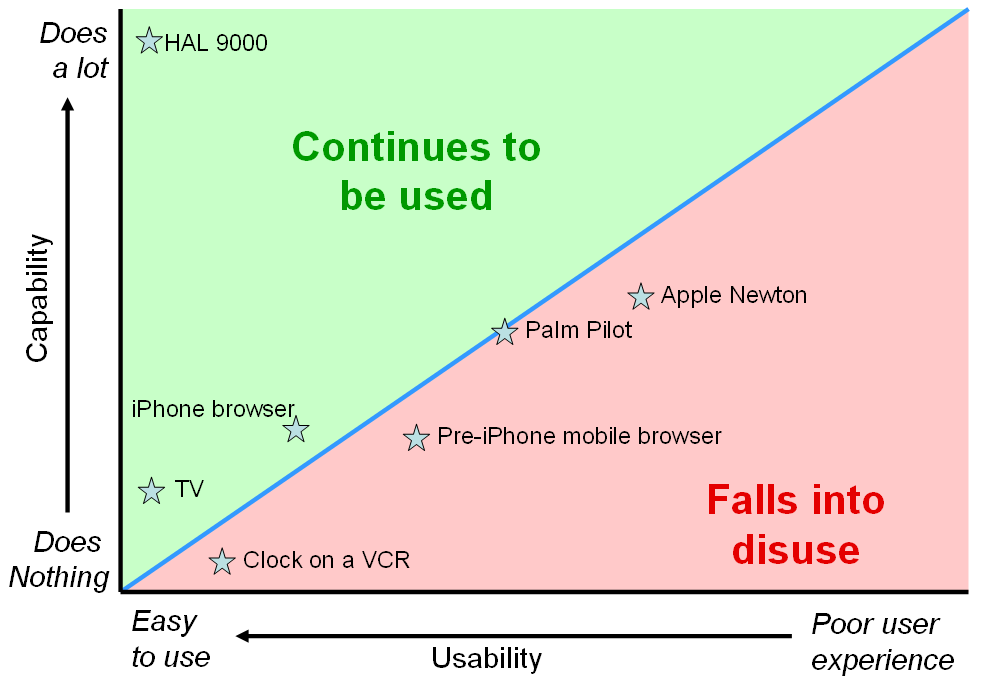
The razor thin line between use and disuse
The point here is that the ‘actual use’ threshold is a a razor-thin line on the smooth scale of usability, so if a product lies close to that line, the tiniest, most subtle change to usability can move it from one side of the line to the other. And in a competitive market where the cost of switching is low, that line isn’t static; the competition is continuously moving the threshold up. This is consistent with “natural selection by variation and survival of the fittest.” So product managers who believe their usability is “good enough,” and that they need to focus on new features to beat the competition are often misplacing their efforts – they may be moving their product further to the right on the diagram above than they are moving it up.

Now let’s go on to Chrome’s single field for URLs and searches. Computer applications address complicated problem spaces. In the diagram below, each circle represents the aggregate complexity of an activity performed with the help of a computer. The horizontal red line represents the division between the complexity handled by the user, and that handled by the computer. In the left circle most of the complexity is dealt with by the user, in the right circle most is dealt with by the computer. For a given problem space, an application will fall somewhere on this line. For searching databases HAL 9000 has the circle almost entirely above this line, SQL is way further down. The classic example of this is the graphical user interface. It is vastly more programming work to create a GUI system like Windows than a command-line system like MS-DOS, and a GUI is correspondingly vastly easier on the user.
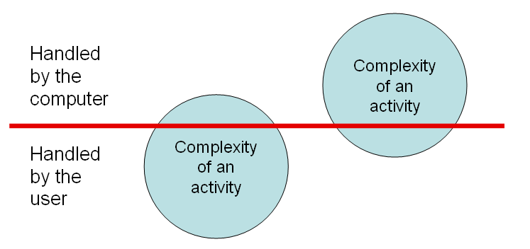
Its single field for typing queries and URLs clearly makes Chrome sit higher on this line than the browsers that use two fields. With Chrome the user has less work to do: he just gives the browser an instruction. With the others the user has to both give the instruction and tell the computer what kind of instruction it is. On the other hand, the programmer has to do more work, because he has to write code to determine whether the user is typing a URL or a search. But this is always going to be the case when you make a task of a given complexity easier on the user. In order to relieve the user, the computer has to handle more complexity. That means more work for the programmer. Hard-to-use applications are the result of lazy programmers.

The programming required to implement the single field for URLs and searches is actually trivial. All browsers have code to try to form a URL out of what’s typed into the address field; the programmer just has to assume it’s a search when that code can’t generate a URL. So now, having checked my four browsers, I have to partially eat my words. Both Firefox and IE8, even though they have separate fields for web addresses and searches, do exactly what I just said: address field input that can’t be made into a URL is treated as a search query. Safari, on the other hand, falls into the lazy programmer hall of shame.

This may be a result of a common “ease of use” fallacy: that what is easier for the programmer to conceive is easier for the user to use. The programmer has to imagine the entire solution space, while the user only has to deal with what he comes across. I can imagine a Safari programmer saying “We have to meet user expectations consistently – it will be confusing if the address field behaves in an unexpected way by doing a search when the user was simply mistyping a URL.” The fallacy of this argument is that while the premise is true (“it is confusing to behave in an unexpected way,”) you can safely assume that an error message is always unexpected, so rather than deliver one of those, the kind programmer will look at what is provoking the error message, and try to guess what the user might have been trying to achieve, and deliver that instead.

There are two classes of user mistake here: one is typing into the “wrong” field, the other is mistyping a URL. On all these browsers, if you mistype a URL you get an unwanted result. On Safari it’s an error page, on the others it’s an error page or a search, depending on what you typed. So Safari isn’t better, it just responds differently to your mistake. But if you make the other kind of “mistake,” typing a search into the “wrong” field, Safari gives an error, while the others give you what you actually wanted. So in this respect, they are twice as good, because the computer has gracefully relieved the user of some work by figuring out what they really wanted. But Chrome goes one step further, making it impossible to type into the “wrong” field, because there is only one field. That’s a better design in my opinion, though I’m open to changing my mind: the designers at Firefox and Microsoft may argue that they are giving the best of both worlds, since users accustomed to separate fields for search and addresses might be confused if they can’t find a separate search field.

iPhone 4 gets competition

When the iPhone came out it redefined what a smartphone is. The others scrambled to catch up, and now with Android they pretty much have. The iPhone 4 is not in a different league from its competitors the way the original iPhone was. So I have been trying to decide between the iPhone 4 and the EVO for a while. I didn’t look at the Droid X or the Samsung Galaxy S, either of which may be better in some ways than the EVO.

Each hardware and software has stronger and weaker points. The Apple wins on the subtle user interface ingredients that add up to delight. It is a more polished user experience. Lots of little things. For example I was looking at the clock applications. The Apple stopwatch has a lap feature and the Android doesn’t. I use the timer a lot; the Android timer copied the Apple look and feel almost exactly, but a little worse. It added a seconds display, which is good, but the spin-wheel to set the timer doesn’t wrap. To get from 59 seconds to 0 seconds you have to spin the display all the way back through. The whole idea of a clock is that it wraps, so this indicates that the Android clock programmer didn’t really understand time. Plus when the timer is actually running, the Android cutely just animates the time-set display, while the Apple timer clears the screen and shows a count-down. This is debatable, but I think the Apple way is better. The countdown display is less cluttered, more readable, and more clearly in a “timer running” state. The Android clock has a wonderful “desk clock” mode, which the iPhone lacks, I was delighted with the idea, especially the night mode which dims the screen and lets you use it as a bedside clock. Unfortunately when I came to actually use it the hardware let the software down. Even in night mode the screen is uncomfortably bright, so I had to turn the phone face down on the bedside table.

The EVO wins on screen size. Its 4.3 inch screen is way better than the iPhone’s 3.5 inch screen. The “retina” definition on the iPhone may look like a better specification but the difference in image quality is indistinguishable to my eye, and the greater size of the EVO screen is a compelling advantage.

The iPhone has far more apps, but there are some good ones on the Android that are missing on the iPhone, for example the amazing Wi-Fi Analyzer. On the other hand, this is also an example of the immaturity of the Android platform, since there is a bug in Android’s Wi-Fi support that makes the Wi-Fi Analyzer report out-of-date results. Other nice Android features are the voice search feature and the universal “back” button. Of course you can get the same voice search with the iPhone Google app, but the iPhone lacks a universal “back” button.

The GPS on the EVO blows away the GPS on the iPhone for accuracy and responsiveness. I experimented with the Google Maps app on each phone, walking up and down my street. Apple changed the GPS chip in this rev of the iPhone, going from an Infineon/GlobalLocate to a Broadcom/GlobalLocate. The EVO’s GPS is built-in to the Qualcomm transceiver chip. The superior performance may be a side effect of assistance from the CDMA radio network.

Incidentally, the GPS test revealed that the screens are equally horrible under bright sunshine.

The iPhone is smaller and thinner, though the smallness is partly a function of the smaller screen size.

The EVO has better WAN speed, thanks to the Clearwire WiMax network, but my data-heavy usage is mainly over Wi-Fi in my home, so that’s not a huge concern for me.

Battery life is an issue. I haven’t done proper tests, but I have noticed that the EVO seems to need charging more often than the iPhone.

Shutter lag is a major concern for me. On almost all digital cameras and phones I end up taking many photos of my shoes as I put the camera back in my pocket after pressing the shutter button and assuming the photo got taken at that time rather than half a second later. I just can’t get into the habit of standing still and waiting for a while after pressing the shutter button. The iPhone and the EVO are about even on this score, both sometimes taking an inordinately long time to respond to the shutter – presumably auto-focusing. The pictures taken with the iPhone and the EVO look very different; the iPhone camera has a wider angle, but the picture quality of each is adequate for snapshots. On balance the iPhone photos appeal to my eye more than the EVO ones.

For me the antenna issue is significant. After dropping several calls I stuck some black electrical tape over the corner of the phone which seems to have somewhat fixed it. Coverage inside my home in the middle of Dallas is horrible for both AT&T and Sprint.

The iPhone’s FM radio chip isn’t enabled, so I was pleased when I saw FM radio as a built-in app on the EVO, but disappointed when I fired it up and discovered that it needed a headset to be plugged in to act as an antenna. Modern FM chips should work with internal antennas. In any case, the killer app for FM radio is on the transmit side, so you can play music from your phone through your car stereo. Neither phone supports that yet.

So on the plus side, the EVO’s compelling advantage is the screen size. On the negative side, it is bulkier, the battery life is less, the software experience isn’t quite so polished.

The bottom line is that the iPhone is no longer in a class of its own. The Android iClones are respectable alternatives.

It was a tough decision, but I ended up sticking with the iPhone.

The iPhone as an eReader

On a recent extended trip to England, I discovered Stanza, an e-reader application for the iPhone. Not only did it demonstrate for me that the iPad will obsolete the Kindle, but that the iPhone can do a pretty good job of it already.
Surprisingly, the iPhone surpasses a threshold of usability that makes it more of a pleasure than a pain to use as an e-reader. This is due to the beautiful design and execution of Stanza. The obvious handicap of the iPhone as an e-reader is the small screen size, but Stanza does a great job of getting around this. It turns out that reading on the iPhone is quite doable, and better than a real book in several ways:

  • It is an entire library in your pocket – you can have dozens of books in your iPhone, and since you have your iPhone with you in any case, they don’t take any pocket space at all.
  • You can read it in low-light conditions without any additional light source.
  • You can read it even when you are without your spectacles, since you can easily resize the text as big as you like.
  • It doesn’t cost anything. If you enjoy fiction, there is really no need to buy a book again, since there are tens of thousands of good books in the public domain downloadable free from sites like Gutenberg.org and feedbooks.com. Almost all the best books ever written are on these sites, including all the Harvard Classics and numerous more recent works by great authors like William James, James Joyce, Joseph Conrad and Philip K. Dick.
  • You can search the text in a book and instantly find the reference you are looking for.
  • It has a built-in dictionary, so any word you don’t know you can look up instantly.
  • It keeps your place – every time you open the app it takes you to the page you were reading.
  • You can make annotations. This isn’t really better than a paper book, since you can easily write marginal notes in one of those, but with Stanza you don’t have to hunt around for a pencil in order to make a note.
  • You don’t have to go to a bookstore or library to get a book. This is a mixed benefit, since it is always so enjoyable to hang out in bookstores and libraries, but when you suddenly get a hankering to take another look at a book you read a long time ago, you can just download it immediately.

All these benefits will apply equally to the iPad and the others in the 2010 crop of tablet PCs, which will also have the benefit of larger screens. But Stanza on the iPhone has showed me that good user interface design can compensate for major form factor handicaps.

VoIP over the 3G data channel comes to the iPhone

I discussed last September how AT&T was considering opening up the 3G data channel to third party voice applications like Skype. According to Rethink Wireless, Steve Jobs mentioned in passing at this week’s iPad extravaganza that it is now a done deal.

Rethink mentions iCall and Skype as beneficiaries. Another notable one is Fring. Google Voice is not yet in this category, since it uses the cellular voice channel rather than the data channel, so it is not strictly speaking VoIP; the same applies to Skype for the iPhone.

According to Boaz Zilberman, Chief Architect at Fring, the Fring iPhone client needed no changes to implement VoIP on the 3G data channel. It was simply a matter of reprogramming the Fring servers to not block it. Apple also required a change to Fring’s customer license agreements, requiring the customer to use this feature only if permitted by his service provider. AT&T now allows it, but non-US carriers may have different policies.

Boaz also mentioned some interesting points about VoIP on the 3G data channel compared with EDGE/GPRS and Wi-Fi. He said that Fring only uses the codecs built in to handsets to avoid the battery drain of software codecs. He said that his preferred codec is AMR-NB; he feels the bandwidth constraints and packet loss inherent in wireless communications negate the audio quality benefits of wideband codecs. 3G data calls often sound better than Wi-Fi calls – the increased latency (100 ms additional round-trip according to Boaz) is balanced by reduced packet loss. 20% of Fring’s calls run on GPRS/EDGE, where the latency is even greater than on 3G; total round trip latency on a GPRS VoIP call is 400-500ms according to Boaz.

As for handsets, Boaz says that Symbian phones are best suited for VoIP, the Nokia N97 being the current champion. Windows Mobile has poor audio path support in its APIs. The iPhone’s greatest advantage is its user interface, it’s disadvantages are lack of background execution and lack of camera APIs. Android is fragmented: each Android device requires different programming to implement VoIP.

Apple iPad has proprietary processor

Well, the Apple iPad is out. Time will tell whether its success will equal that of the iPhone, the Apple TV or the MacBook Air. I’m confident it will do better than the Newton. The announcement contained a few interesting points, the most significant of which is that it uses a new Apple proprietary processor, the A4. Some reviewers have described the iPad as very fast, and with good battery life; these are indications that the processor is power efficient. Because of its software similarities to the iPhone, the architecture is probably ARM-based, with special P.A. Semi sauce for power and speed. On the other hand, it could be a spin of the PWRficient CPU, which is PowerPC based. In that light, it is interesting to review Apple’s reasons for abandoning the Power PC in 2005. Maybe Apple’s massive increase in sales volume since then has made Intel’s economies of scale less overwhelming?

The price is right, as is an option to go without a 3G radio. The weight is double that of a Kindle, and half that of a MacBook Air.

I am disappointed that there is no user-pointing camera, because as I mentioned earlier, I think that videophone will be a major use for this class of device.

Update 3 February 2010: Linley Gwenapp wrote up some speculations in his newsletter.

First 802.11n handset spotted in the wild – what took so long?

The fall 2009 crop of ultimate smartphones looks more penultimate to me, with its lack of 11n. But a handset with 802.11n has come in under the wire for 2009. Not officially, but actually. Slashgear reports a hack that kicks the Wi-Fi chip in the HTC HD2 phone into 11n mode. And the first ultimate smartphone of 2010, the HTC Google Nexus One is also rumored to support 802.11n.

These are the drops before the deluge. Questions to chip suppliers have elicited mild surprise that there are still no Wi-Fi Alliance certifications for handsets with 802.11n. All the flagship chips from all the handset Wi-Fi chipmakers are 802.11n. Broadcom is already shipping volumes of its BCM4329 11n combo chip to Apple for the iTouch (and I would guess the new Apple tablet), though the 3GS still sports the older BCM4325.

Some fear that 802.11n is a relative power hog, and will flatten your battery. For example, a GSMArena report on the HD2 hack says:

There are several good reasons why Wi-Fi 802.11n hasn’t made its way into mobile phones hardware just yet. Increased power consumption is just not worth it if the speed will be limited by other factors such as under-powered CPU or slow-memory…

But is it true that 802.11n increases power consumption at a system level? In some cases it may be: the Slashgear report linked above says: “some users have reported significant increases in battery consumption when the higher-speed wireless is switched on.”

This reality appears to contradict the opinion of one of the most knowledgeable engineers in the Wi-Fi industry, Bill McFarland, CTO at Atheros, who says:

The important metric here is the energy-per-bit transferred, which is the average power consumption divided by the average data rate. This energy can be measured in nanojoules (nJ) per bit transferred, and is the metric to determine how long a battery will last while doing tasks such as VoIP, video transmissions, or file transfers.

For example, Table 1 shows that for 802.11g the data rate is 22 Mbps and the corresponding receive power-consumption average is around 140 mW. While actively receiving, the energy consumed in receiving each bit is about 6.4 nJ. On the transmit side, the energy is about 20.4 nJ per bit.

Looking at these same cases for 802.11n, the data rate has gone up by almost a factor of 10, while power consumption has gone up by only a factor of 5, or in the transmit case, not even a factor of 3.

Thus, the energy efficiency in terms of nJ per bit is greater for 802.11n.

Here is his table that illustrates that point:
Effect of Data Rate on Power Consumption

Source: Wireless Net DesignLine 06/03/2008

The discrepancy between this theoretical superiority of 802.11n’s power efficiency, and the complaints from the field may be explained several ways. For example, the power efficiency may actually be better and the reports wrong. Or there may be some error in the particular implementation of 802.11n in the HD2 – a problem that led HTC to disable it for the initial shipments.

Either way, 2010 will be the year for 802.11n in handsets. I expect all dual-mode handset announcements in the latter part of the year to have 802.11n.

As to why it took so long, I don’t think it did, really. The chips only started shipping this year, and there is a manufacturing lag between chip and phone. I suppose a phone could have started shipping around the same time as the latest iTouch, which was September. But 3 months is not an egregious lag.